Real cases
Real UX readings
Six website readings generated from captured evidence. Each example shows what UXMachine saw, what to review first, and where the reading has limits.
Examples based on public homepages. They do not imply a commercial relationship, commission, validation or approval by the analyzed brands.
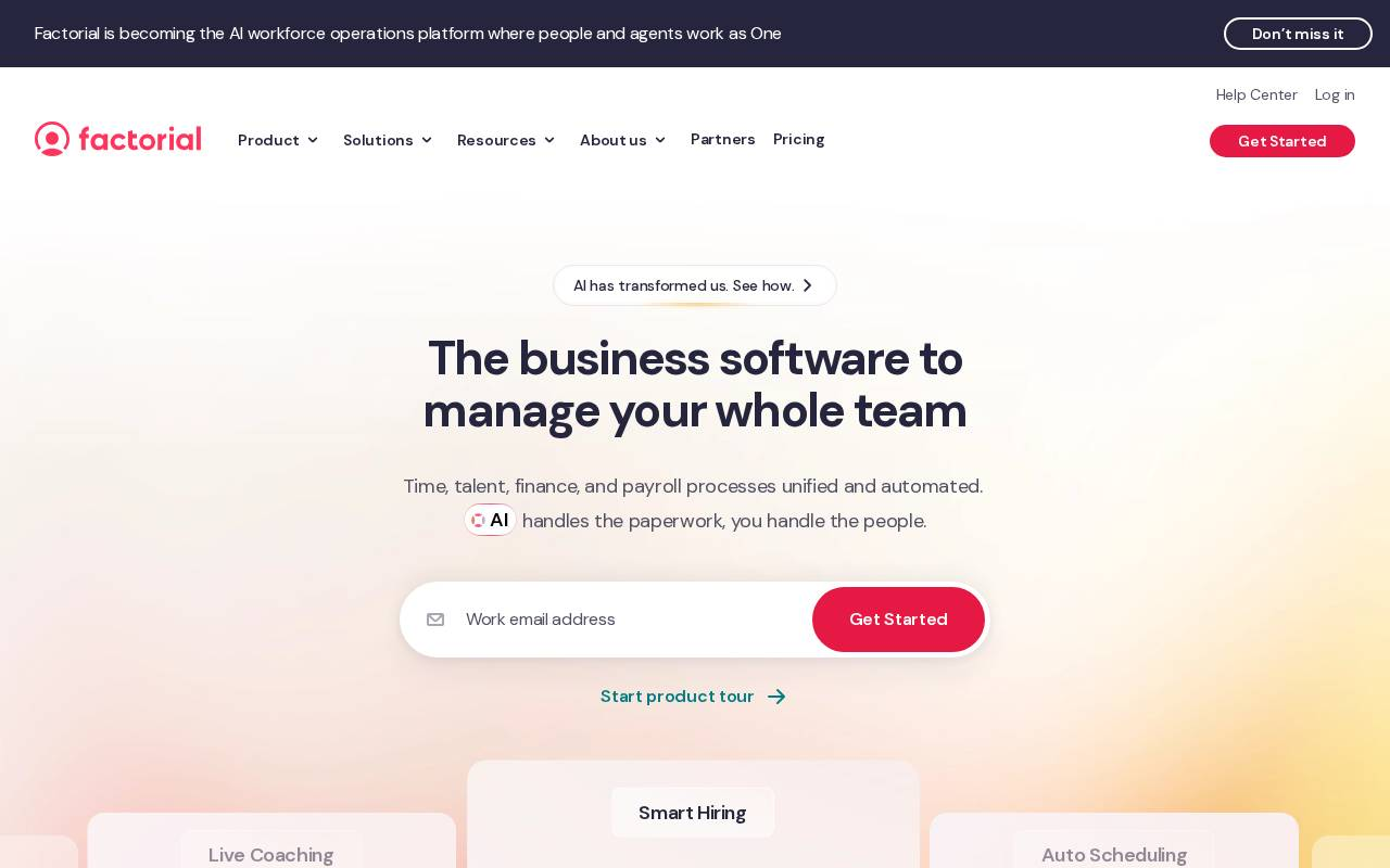
Factorial
Usable reading with caveatsA clear first fix: 26 images carry no alt text.
Factorial's hero — 'The business software to manage your whole team' — reads clearly. The reading lands one deterministic fix: 26 images on the page have no alt attribute, so screen readers announce nothing for them. It stops short of ranking the hero's actions — 12 plausible actions compete in the first viewport and none clearly dominates — flagging that as something to confirm, not decide.
What to review first
Which single action should lead the hero. The reading counts 12 plausible actions in the first viewport with no clear winner, so it holds back from ranking them until the page's intended primary action is confirmed.
Reading captured on 2026-07-15. Sites change.
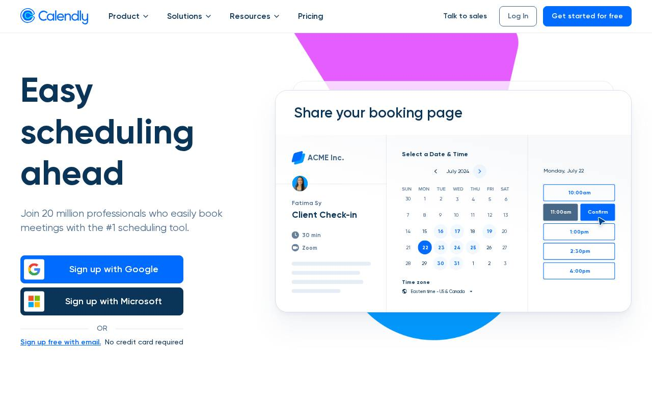
Calendly
Clean readingA focused hero that still ships three competing sign-up paths.
Calendly's hero is clean: a booking-page mockup, a single promise ('Easy scheduling ahead'), and social proof. The reading flags three sign-up paths — Google, Microsoft, email — plus 'Get started for free,' splitting the first decision the visitor makes.
What to review first
Whether one primary sign-up path should visually dominate the other two.
Reading captured on 2026-07-09. Sites change.
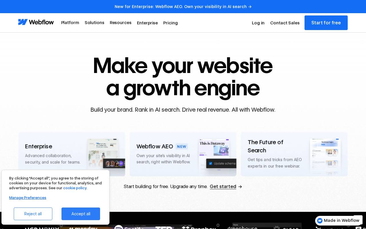
Webflow
Usable reading with caveatsThe hero's primary action reads more like a text link than a button.
Webflow's hero — 'Make your website a growth engine' — is bold and clear, but the reading flags that the primary call to action lacks button affordance, with four calls to action competing in the hero region.
What to review first
Whether the primary action looks clickable enough to win against the other hero calls to action.
Reading captured on 2026-07-09. Sites change.
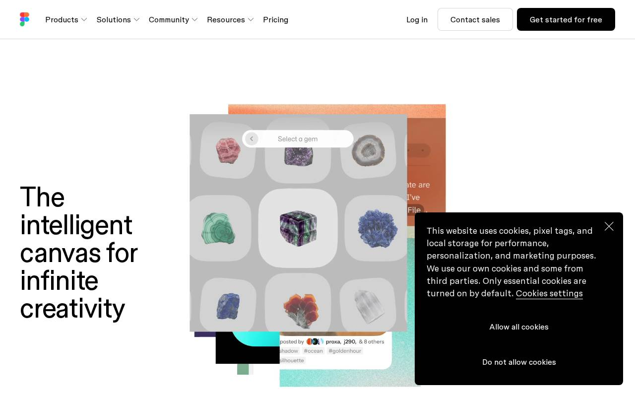
Figma
Clean readingThe consent overlay overlaps the hero on the first visit.
Figma's hero — 'The intelligent canvas for infinite creativity' — is strong, but the reading detects a consent overlay that overlaps the hero region on the first visit, competing with 'Get started for free.' Seven calls to action sit above the fold.
What to review first
Whether the consent overlay blocks the primary action on the first, highest-intent visit.
Reading captured on 2026-07-09. Sites change.
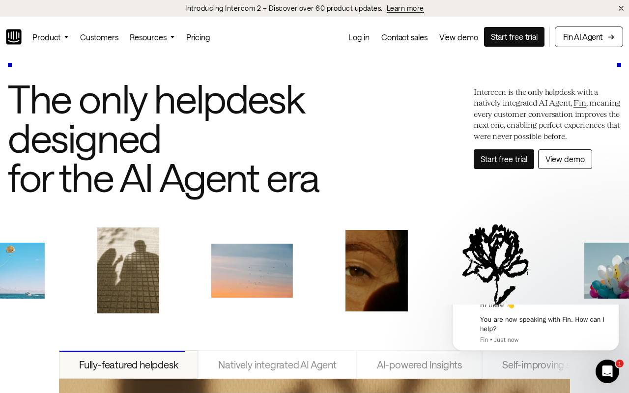
Intercom
Usable reading with caveatsSeven calls to action share the fold above a single hero.
Intercom's hero — 'The only helpdesk designed for the AI Agent era' — arrives with seven calls to action above the fold (one primary 'Start free trial' plus six secondary) and 137 interactive elements on the page, alongside a chat widget that opens on load.
What to review first
Whether seven above-the-fold calls to action leave one obvious next step.
Reading captured on 2026-07-09. Sites change.
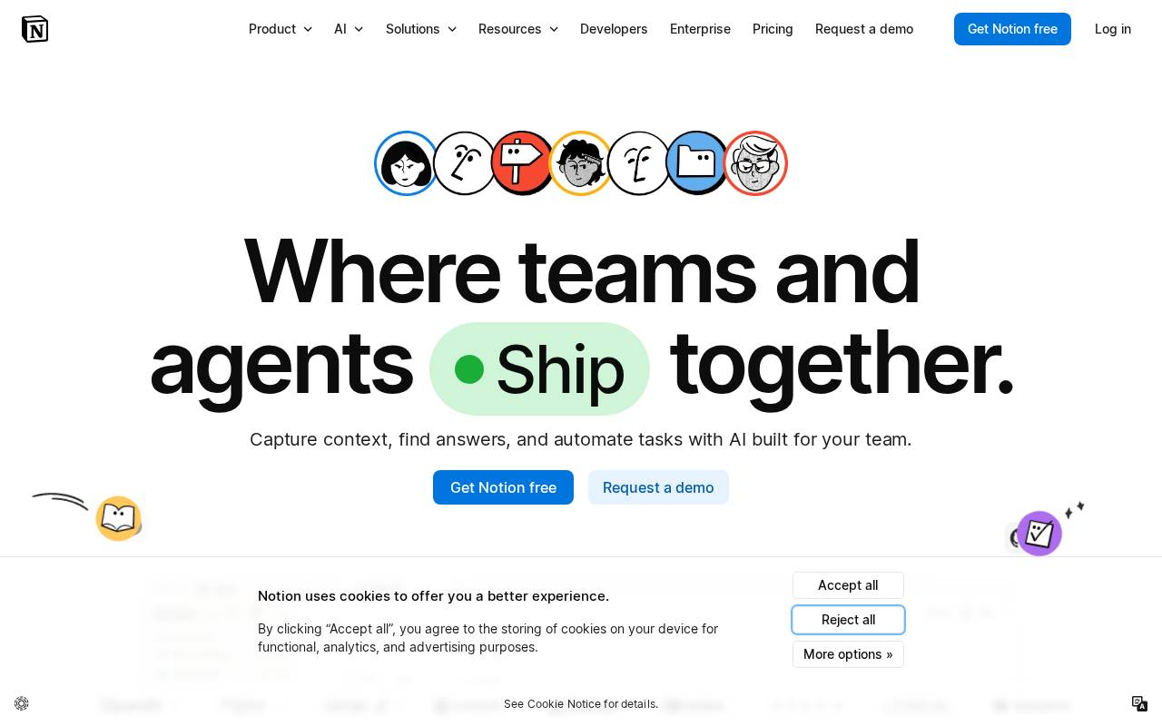
Notion
Clean readingA dense hero: 22 interactive elements compete before the first scroll.
Notion leads with 'Where teams and agents Ship together' and a live product mockup. The reading counts 153 interactive elements on the page — 22 of them above the fold — with a consent banner landing directly under the hero calls to action.
What to review first
Whether the above-the-fold interactive density pulls attention away from the single primary action.
Reading captured on 2026-07-09. Sites change.