Webflow
Usable reading with caveatsSource: https://webflow.com/
Reading captured on 2026-07-09. Sites change.
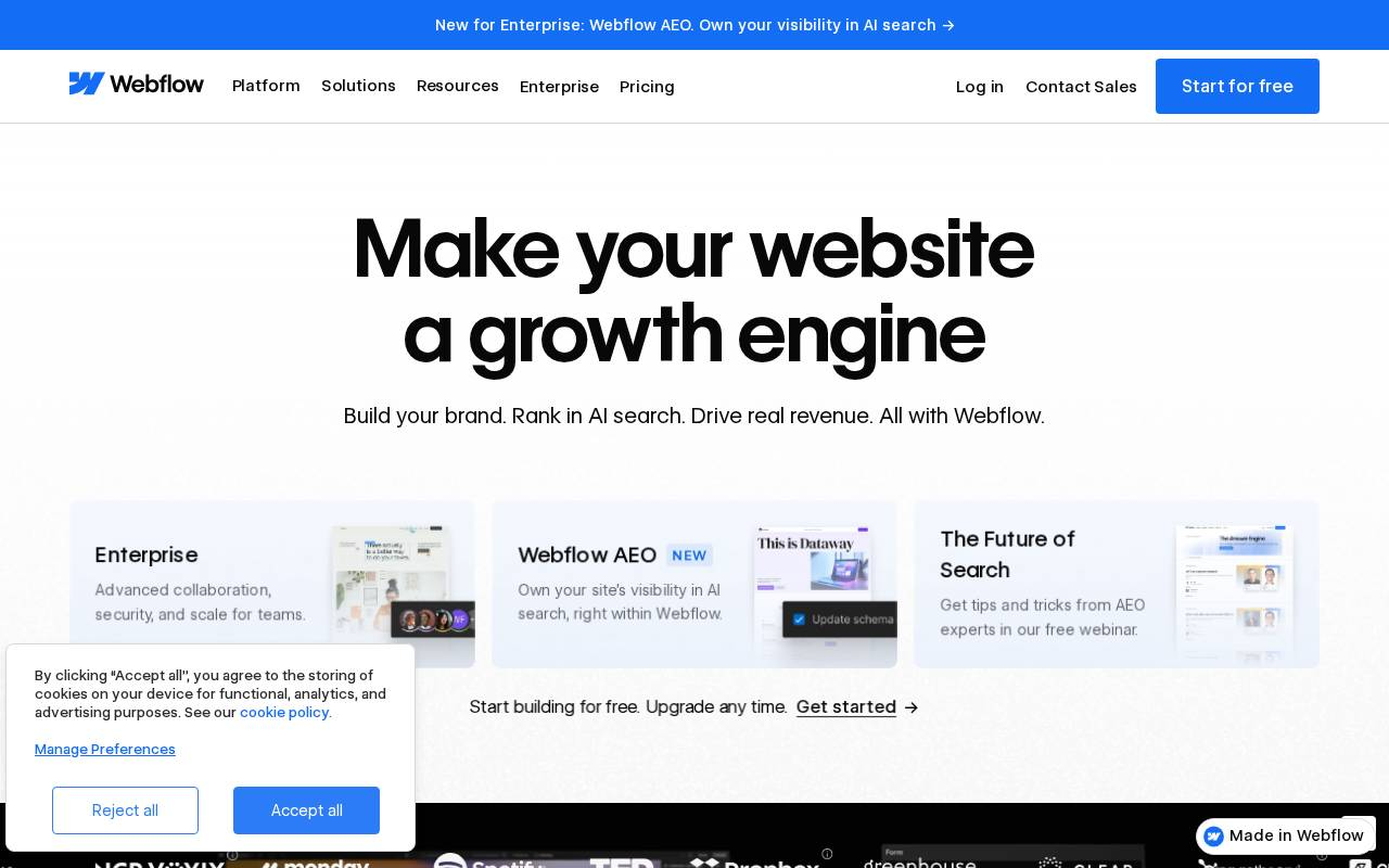
Executive summary
The hero's primary action reads more like a text link than a button.
A bold hero whose primary action does not clearly read as a button, sitting among four competing calls to action in the hero region.
What to review first
Whether the primary action looks clickable enough to win against the other hero calls to action.
Observed pattern
A primary action without clear button affordance forces the eye to hunt for the step among competing links.
Evidence
- Four calls to action in the hero region; the primary reads 'Start for free.'
- 115 images without alternative text across the page.
- Six estimated colour-contrast issues detected.
Caveats
This reading is usable, but some visual text signals require caution. The recommendation is framed as what to review first, not as a final verdict.
Full report
What the reading saw
A bold hero headline with four calls to action in the hero region, where the primary action ('Start for free') does not clearly read as a button. The page also shows 115 images without alternative text.
Why it matters
If the primary action does not look clickable, the eye has to hunt for it among competing links — adding friction to the very first step.
What to review first
Give the primary action clear button affordance so it stands apart from the surrounding links.
What not to conclude yet
Some visual text signals in this reading require caution, so treat it as a starting point for review rather than a final verdict.
See what UXMachine finds on your page.
Run a diagnosis