Notion
Clean readingSource: https://notion.com/
Reading captured on 2026-07-09. Sites change.
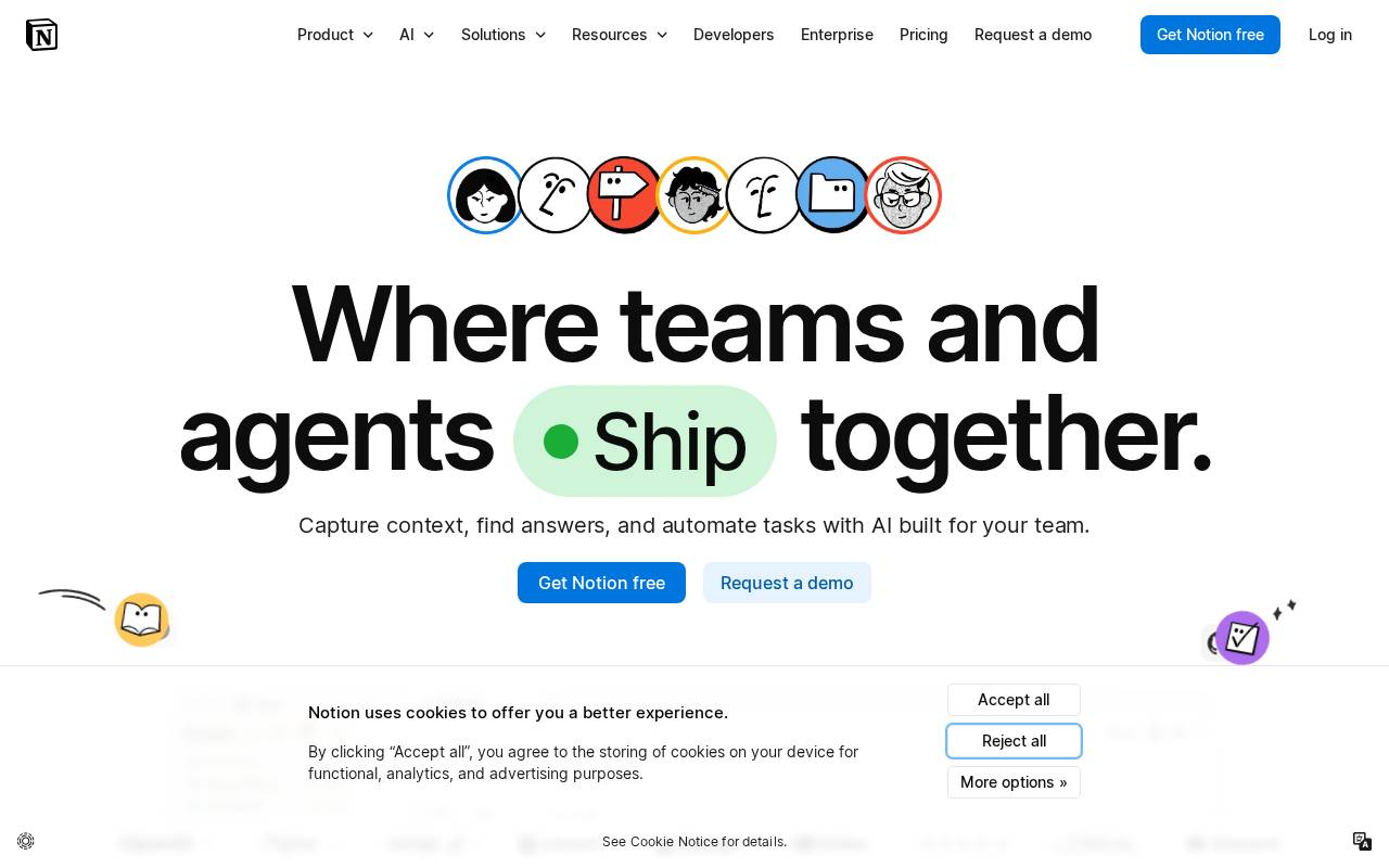
Executive summary
A dense hero: 22 interactive elements compete before the first scroll.
A strong, product-led hero carrying high interactive density. The main action, 'Get Notion free,' shares the fold with a second call to action and a dense grid of clickable cards.
What to review first
Whether the above-the-fold interactive density pulls attention away from the single primary action.
Observed pattern
High interactive density near the hero raises the cost of finding the one primary action.
Evidence
- 153 interactive elements on the page, 22 of them above the fold.
- 405 distinct text blocks across the page.
- The primary 'Get Notion free' action shares the hero with a 'Request a demo' action.
Full report
What the reading saw
A clear hero headline and a live product mockup, with 153 interactive elements on the page and 22 of them above the fold. A consent banner sits directly beneath the hero calls to action.
Why it matters
When many interactive elements share the first viewport, the single conversion action has to compete for attention. The more equal-weight choices sit near it, the more effort it takes to spot the one primary step.
What to review first
Check whether the above-the-fold density can be reduced so 'Get Notion free' stands out, and whether the consent banner can sit lower so it does not overlap the product story.
What not to conclude yet
This is one reading on one day. It does not measure conversion or claim the page underperforms — it points to where a closer review should start.
See what UXMachine finds on your page.
Run a diagnosis